Anyone who knows me well will not be surprised to hear that choosing the color to paint my van has been an agonizing process! You might think that my years as an artist would help, but no. I went through a long, expensive process when choosing the color of red for our house. And, come on, the van is way more important than the house!
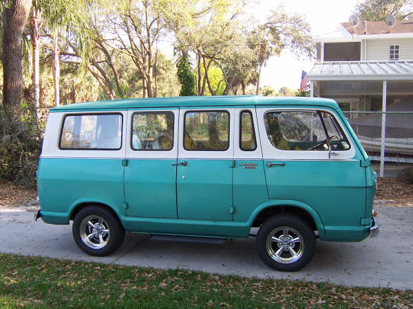
I saw this van for sale in Florida a long time ago and knew this was the color scheme I wanted:

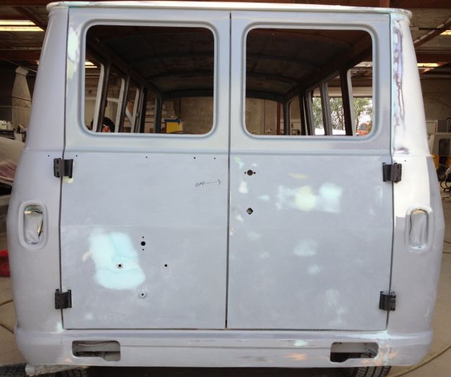
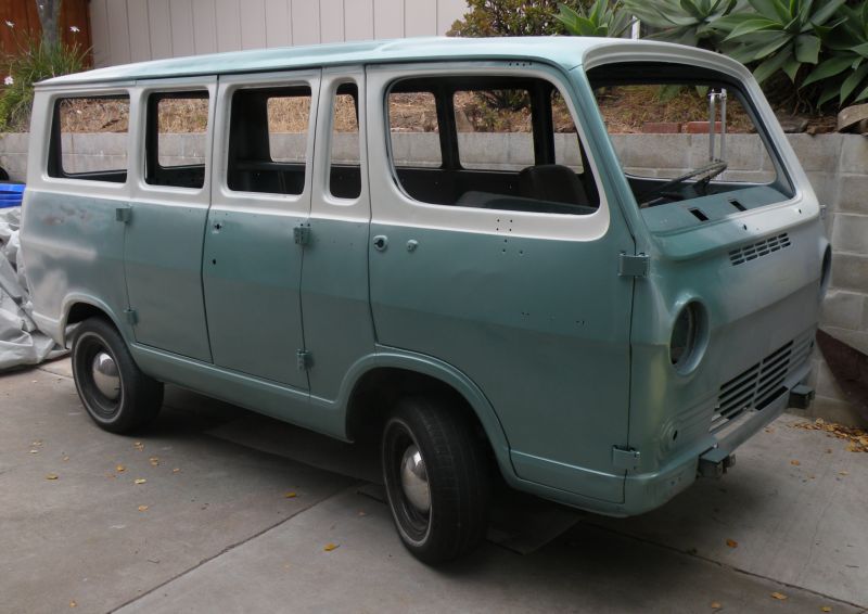
When I took my van out of the first body shop, they had a lot of it sanded down to bare metal, so I had to put some paint on it while I searched for a better body shop. So I took the opportunity to test out a color. I had a local auto body supply store mix up the Chevrolet "Turquoise Poly" 510 that my van came with. But when I sprayed it on, it looked too silvery and green.

I was thrilled to see my current body shop had so many shades to choose from! They have a BASF paint mixing machine and its Color-Max paint matching system consists of hundreds of chips that are the actual paint sprayed on a 2"x4" cards. I was thrilled until it came time to pick one!
I looked through these blues and found those with the most green since I was going for turquoise. I chose the second and third from the left book and then a much lighter one, the second in the right book. They looked like nice, bright but retro colors, looking at them straight-on in the sun:

But after seeing the colors sprayed on a test door, I started learning about a thing called flop! With today's metallic paint, you need to look at the color's "side tone". A lot of them change dramatically in hue, chroma (saturation), and value when seen from the side. This can be due to a lot of things like the size of the metal flakes, if it has any pearl, etc. So look at the same color chips from the side. They get a lot darker:

So here's what I was seeing:


This can make a paint job look really cool, emphasize the contours, etc. In fact, this explained the contrast I was seeing in this Corvan photo. Looks cool but wasn't quite what I was after:

(I need to point out that these colors look totally different in photographs! They go bluer and get more contrasty.)
After these three paint tests I was asking them if they could make it a little greener, less flop, finer metal flakes, etc. (really testing their patience). There are so many variables! They said it would be best if I could find a chip I liked, or find a car with a fatory color, so they could have an exact formlua. Well, there aren't many turquoise cars these days! I did come across a 2012 Honda that looked very nice, not exactly retro, but I had them try it.

I loved how the car looked (and, again, the photo doesn't really capture it) but two different BASF recipes for that car didn't look right. Too blue and dark for me.
I should point out that each go around with a new color costs me for paint and an hour of their time! This was getting very stressful for me and for them, I'd say! I kept asking for their advice on this but they really wanted a formula, not just descriptions from me.
Fortunately I had dragged my roommate into this whole decision process and she had grabbed a couple of the green books. I thought those would all be too green but she found two candidates, one light, one deeper. So I had them try those two out. Here's one of the Honda colors along with the two greens:

The one on the right is their Honda color! I tell ya, it is really tricky with these metallics. It literally depends on how you look at it! Here are all the color tests:

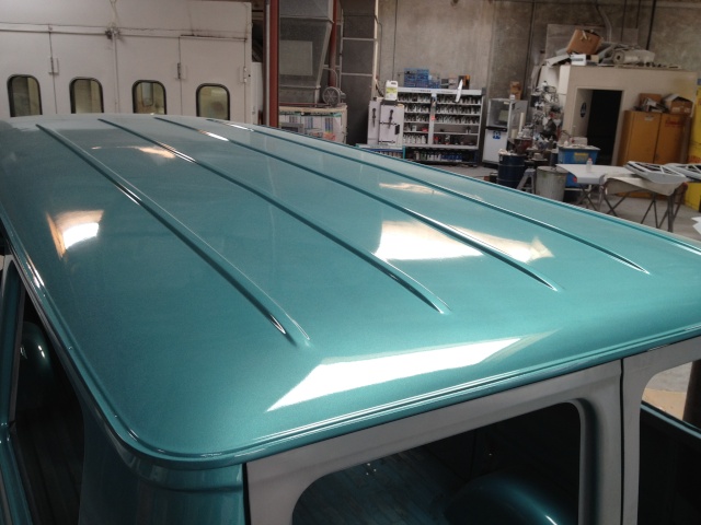
But I have a color I'm happy with! The solution was to not look at them all together. Each color affects your impresson of the one next to it. I took these test doors home and covered up all the other tests and looked at them one by one. And here is the winner! It was the lighter of those final greens:

The photos do show how it changes in different angles, times of day, in sun and shade. I've been looking out at it in the driveway throughout the weekend and I'm loving it! What a relief! Monday I tell them to go ahead and start painting the van!!
