


I do kinda miss the big 'AGE', but the line-up is cool!
+26
wideload
texasjohn
donivan65
Donn
sonnygable
mcfly
mo_1040
southern man
Magic Bus
Scott
chester42
benwah
BvrWally
VANagain
bugeye bob
Hangtime
itruns
Vanish
kiwimopar
panelmanrd
wacko
EconoUSAparts
G-Man
BajaCharlie
Admin
sasktrini
30 posters
New Logo is AWESOME!!!

sasktrini- Number of posts : 2067
Location : Saskatoon, SK, Canada
Registration date : 2008-05-20

Guest- Guest
would make an awesome t
sasktrini- Number of posts : 2067
Location : Saskatoon, SK, Canada
Registration date : 2008-05-20
erbfreak wrote:would make an awesome t
YEAH!!! I AGREE!!! Drink coozies, mugs, hats... you name it! Whaddaya say, chebby? Good idea, yes?

Admin- Admin
- Number of posts : 1731
Location : San Diego, California
Registration date : 2008-05-01
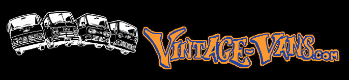
as a matter of fact, that's what we were thinking  this artwork is by XjamesX, I just tweeked it a bit
sasktrini- Number of posts : 2067
Location : Saskatoon, SK, Canada
Registration date : 2008-05-20
nice work!!! I'll start making room in my cupboard and closet!!!
BajaCharlie- Number of posts : 619
Location : Knott's Berry Farm
Registration date : 2010-01-07
too many chevys though,ha ha
G-Man- Mayor

- Number of posts : 30743
Location : Fowlerville, MI
Age : 62
Registration date : 2008-05-06
chebby I like the tweek
Guest- Guest
I'm all about the new logo! I actually got my first T last week, but my visa is ready and waiting for the release of these bad boys!! RAD!
Guest- Guest
I'm in for a T-shirt with the new look! Looking forward when they're ready to be selling. I like how the vans line up and that vintage-style logo.

EconoUSAparts- Number of posts : 2198
Location : Ft Thomas,Ky
Registration date : 2008-05-17
Ok,Im sorry if I ruffle some feathers so I'll apologize in advance. Here's my take on the new logo. I too like the old emphasis on the AGE in VintAGE Vans. After all,that's what this sites main focus is all about,A's,G's and E's. I would like to see that stay.
I have to wonder why there are no pickups featured??? Maybe put them on the other side of the shirt with VintAGE Vanup written on it???
Im also curious as to why both G vans shown are Chevy's? Did we forget about GMC's?
Is it just me or does this new logo look kinda Haloweenish/gobliny? I know it's partially the colors which remained the same but the vans give me the creeps with those eyeballs in the headlights and the swooping winged font makes it seem to me as if the vans are flying in the night sky.(and no I didnt just drop acid and halucinate this) I feel like Im watching the movie CARS. Where's Mater?
Lastly, I understand the need for a "fresh" logo so Im all for that. Theres nothing I would call "wrong" with the artwork but I dont care for the bright white shading of the interiors. Just wanted to add my opinion on it for whatever it's worth.
P.S.- My son just walked in and I asked his opinion of the logo. He is an art major and graduates this year from the Cincinnati Art Academy. His only comment was that the font was too "urban" as he put it. I had no clue what that meant so I had to ask him. He said the font was too new wave and didnt compliment the era of the old vans and that he would use a more "vintage" style font. Dang,it seems like the kid is actually learning something after all the money I ve forked out for his education:-)
P.P.S.- Again,not trying to throw stones,just wanted to offer my opinion/alternatives since this design revamp wont happen often.
wacko- Number of posts : 423
Location : Chilliwack, BC Canada
Registration date : 2008-05-20
I like it. Simple as that. I think the font is Sweet!! Looking forward to seeing it on some t's
EconoUSAparts- Number of posts : 2198
Location : Ft Thomas,Ky
Registration date : 2008-05-17
wacko wrote:I like it. Simple as that. I think the font is Sweet!! Looking forward to seeing it on some t's
And that my friend is what makes this world a great place,diversity of tastes and opinions. We all have our own preferences,which are just that,preferences. Nothing wrong with that,just personal taste. I respect your opinion. Again, I want to emphasize that Im not trashing the artwork,which by the way is very good. I know only too well after 4 years of art projects all over my home the amount of time and effort that goes into any design. My son is very talented but I personally cant draw a decent stick figure.
Last edited by EconoUSAparts on Sat Apr 17, 2010 6:40 am; edited 1 time in total (Reason for editing : spelling)
panelmanrd- Number of posts : 801
Location : kcmo
Age : 63
Registration date : 2009-10-04
will make a great t shirt, I would wear one prooudly!!!!!!!!!!!!!!!!

kiwimopar- Number of posts : 745
Location : New Zealand
Registration date : 2010-01-23
sasktrini wrote:erbfreak wrote:would make an awesome t
YEAH!!! I AGREE!!! Drink coozies, mugs, hats... you name it! Whaddaya say, chebby? Good idea, yes?
.....and mouse pads
G-Man- Mayor
- Number of posts : 30743
Location : Fowlerville, MI
Age : 62
Registration date : 2008-05-06
Tim this artwork was made by xjamesx I'm guess for this personnal use. Somehow Bill got ahold of it. (Bill with have to tell you the story so its right) Bill thought it would make a great t-shirt. I got ahold of the artwork and had my vinyl guy clean it up for Bill and myself. xjamesx said we both could use it. (was going to save this, but this artwork will be on the Baker's stuff this year). In the artwork I sent Vanish & Chebby the white part you see was Black, but because this forum has a black backgound chebby had to go the other way. Maybe down the road we can ask xjamesx to draw a logo just for here that has all models of our early's

Vanish- Admin
- Number of posts : 5155
Location : Hesperia Cal
Registration date : 2008-05-02
Well this is How The story Go's ... We Needed some art for The New T-Shirts ... And I Immediately was Thinking of X-James ... and He was Good enough To take some time out to Draw this up .... Witch I personally Think is Great ... any way ... James Drew it up and sent it to me .... However The copy I had gotten from Him was Not a good enough copy to work with for stickers or shirts ... it Just needed to be cleaned up and Put in a different format .. that's were Chris comes in... he was Good enough to Have this done for the shirt shop ... so there you have it .... But there's One more part to this story ... Chebby got it and said hey Lets use this to promote the new shirts .... Lets remove OUR LOGO and put it up on the forum to be previewed By every one .... So having it up on our Board is Just to promote the shirts ... Just like when you go to Google and lets say for st Patrick's Day the will have a Rainbow and a Pot of Gold up there to say Hey Happy st Patrick's Day ....... Same thing... as Far as I know This is Just to Build some steam for our T-Shirt Campaign ...... and Our Logo will remain the same .... unless this one is Liked Better ?????????
_________________
,,,Vanish,,,
http://vintage-vans.smugmug.com/Vans/Vanishs-65-Chevy-No-Door-Van/1767214_JCoT4#88846115_B3BP3
http://public.fotki.com/Vintage-Vans/vintage-vans-es/cant-a-ford-it/
http://public.fotki.com/Vintage-Vans/
MCMLXV
sasktrini- Number of posts : 2067
Location : Saskatoon, SK, Canada
Registration date : 2008-05-20
Well, that's sneaky! I thought it was a rebranding.
Speaking of branding Tim, GMC isn't the only one absent from this art... no Fargo A100 or Mercury Econoline... no Corvairs. And as you pointed out,no pickups. That would be too much for a bold graphic.
What if the brand badges were removed from the graphic, so the vans were brand neutral?
Speaking of branding Tim, GMC isn't the only one absent from this art... no Fargo A100 or Mercury Econoline... no Corvairs. And as you pointed out,no pickups. That would be too much for a bold graphic.
What if the brand badges were removed from the graphic, so the vans were brand neutral?
Vanish- Admin
- Number of posts : 5155
Location : Hesperia Cal
Registration date : 2008-05-02
I Kinda Like the Brand Neutral ... Thing .... Before you Print 1000.00 Dollars worth of T-Shrirts .... you want to know what people think .....
_________________
,,,Vanish,,,
http://vintage-vans.smugmug.com/Vans/Vanishs-65-Chevy-No-Door-Van/1767214_JCoT4#88846115_B3BP3
http://public.fotki.com/Vintage-Vans/vintage-vans-es/cant-a-ford-it/
http://public.fotki.com/Vintage-Vans/
MCMLXV
EconoUSAparts- Number of posts : 2198
Location : Ft Thomas,Ky
Registration date : 2008-05-17
Chris, I like the lineup and Xjames did great artwork. I woulda just liked to see a few things tweaked especially for the t-shirts to make it much different than the previous one most of us wear the heck out of now.(one of my favorite t's) Color being the biggest thing,we did the Haloween thing already so I thought a color change woulda been nice. However,if you guys are stuck on those colors,a neon orange shirt wouldnt be as hot as the black ones and you could use the black background like what is seen on the old logo on the homepage currently that hasnt been changed yet. I like those neon orange shirts the road construction guys wear.
Count me in on the brand neutral thing. That's an excellent idea and so simple to do.
I was very hesitant at first to say anything about this whole deal because its hard to not come off as being negative when all Im really trying to do is offer alternatives and promote other ideas to make this one kick ass t-shirt,just like the site its promoting is. Ideas like "brand neutral" are exactly what Im trying to draw out of you folks. Collectively here Im sure we have some great ideas to offer. I probably understand more than most what all goes into a design like this and any changes since I see my son do it all the time both free hand and on his Mac computer. Recently he did several variations of Dave Jarvis's Chevy van for a t-shirt design. At first glance they appear the same but each was different.
Last edited by EconoUSAparts on Sat Apr 17, 2010 7:31 am; edited 1 time in total (Reason for editing : error)

itruns- Number of posts : 1605
Location : Chicago, IL
Registration date : 2008-07-03
Just to throw it out there - I like what's up there.
IMO having the brand names on the vans (or are they van-ups? ) shows the unity/neutrality of the site to the newbies. It was through this site that I found out there were two generations of GM vans and that they were called 'G's.
Maybe make one of the Chevys a GMC?
Definitely with Tim on the T color. Black = HOT! -> body salt stains
IMO having the brand names on the vans (or are they van-ups?
Maybe make one of the Chevys a GMC?
Definitely with Tim on the T color. Black = HOT! -> body salt stains
Admin- Admin
- Number of posts : 1731
Location : San Diego, California
Registration date : 2008-05-01
How do you like the new tweek to Xjames' artwork?
G-Man- Mayor
- Number of posts : 30743
Location : Fowlerville, MI
Age : 62
Registration date : 2008-05-06
I think it looks even better now
Guest- Guest
i was also thinking change one of the chev's to a handi..
here's my .02:
i like how the vans are swooping down making room for the lettering - but something was lost in translation with the words and the fonts. i'm not the first to mention, but vint-AGE is necessary. and maybe this font was going for a retro feel - the color combination throws it straight into halloweenland. (picture dracula jumping out from behind a tree and screaming "VINTAGE VANS!")
at this point - with the background changed to orange perhaps it ought to just stay a logo on the forum page. stick with the old shirt design and just do a "second gen" run with a different shirt color?
In conclusion, love the new art - brand neutrality isn't an issue as most vanners can identify by body style anyway - and there isn't a way to squeeze a hundred van styles into one logo.
here's my .02:
i like how the vans are swooping down making room for the lettering - but something was lost in translation with the words and the fonts. i'm not the first to mention, but vint-AGE is necessary. and maybe this font was going for a retro feel - the color combination throws it straight into halloweenland. (picture dracula jumping out from behind a tree and screaming "VINTAGE VANS!")
at this point - with the background changed to orange
In conclusion, love the new art - brand neutrality isn't an issue as most vanners can identify by body style anyway - and there isn't a way to squeeze a hundred van styles into one logo.
BajaCharlie- Number of posts : 619
Location : Knott's Berry Farm
Registration date : 2010-01-07
Like the logos but can ya get rid of the blank liscense plates
Admin- Admin
- Number of posts : 1731
Location : San Diego, California
Registration date : 2008-05-01
Orange & Black were MY school colors! Nobody accused us of trying to Trick or Treat year round 


|
|
|